Greetings! I'm Aneesh Sreedharan, CEO of 2Hats Logic Solutions. At 2Hats Logic Solutions, we are dedicated to providing technical expertise and resolving your concerns in the world of technology. Our blog page serves as a resource where we share insights and experiences, offering valuable perspectives on your queries.
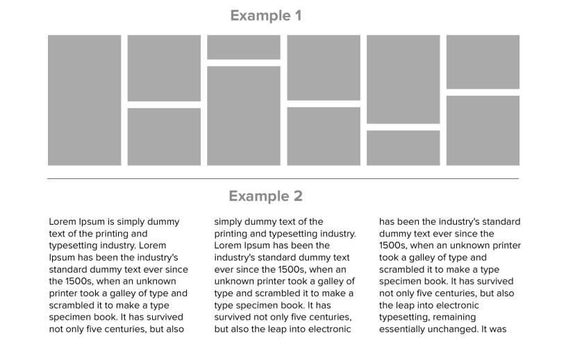
This is a common requirement with modern design trends to be able to stack up divs in a nice masonry fashion even if they have different heights. See the image below. Here we will show how to do it easily with just CSS. The divs with dynamic content have different heights and they create white space below them and take the height of the highest div in the row. We will remove this space and stack them as shown in the image. See the below HTML and the CSS.
HTML
| 1 2 3 4 5 6 7 8 9 10 | <div class="floating-div-wrap"> <div class="floating-container"> <div class="floating-item" style="height: 120px;">Item 1</div> <div class="floating-item" style="height: 260px;">Item 2</div> <div class="floating-item" style="height: 210px;">Item 3</div> <div class="floating-item" style="height: 180px;">Item 4</div> <div class="floating-item" style="height: 160px;">Item 5</div> <div class="floating-item" style="height: 260px;">Item 6</div> </div> </div> |
CSS
| 1 2 3 4 5 6 7 8 9 10 11 12 13 14 15 16 17 18 | .floating-div-wrap{ padding: 15px; } .floating-container { column-count: 3; column-gap: 10px; } .floating-item { display: inline-block; width: 100%; margin-bottom: 10px; box-sizing: border-box; } .floating-item { background-color: #aaaaaa; padding: 10px; } |
Hope this will help someone in need.


Related Articles